


Research Partners’ Marketing and Operations Consultant, Olga Grapsas shares her experience with design and marketing when it comes to visualizing the output of data, including, but not limited to talent mapping, pipelines and organograms.
A Picture is Worth a Thousand Words
I know how important it is to tell a clear story – especially as our current digital age is unsatiably visually driven. I therefore often play with information in such a way that it’s easily relatable and instantly digested.
To go through a longlist of candidates requires an active attention (and revelation) to process the journey of so many individuals from different backgrounds, skillsets, and geographies. When we are looking at a particular industry or job function there is a plethora of talent intelligence that can be revealed. Over the years, I have come to realize that sourcing can take many long hours, weeks and sometimes even months to capture the required insight that then ultimately leads to a sum of data. Why not make it beautiful?
That’s why I find it crucial to showcase insight through creative and visually pleasing ways so that the viewer can be just as excited as the researcher!
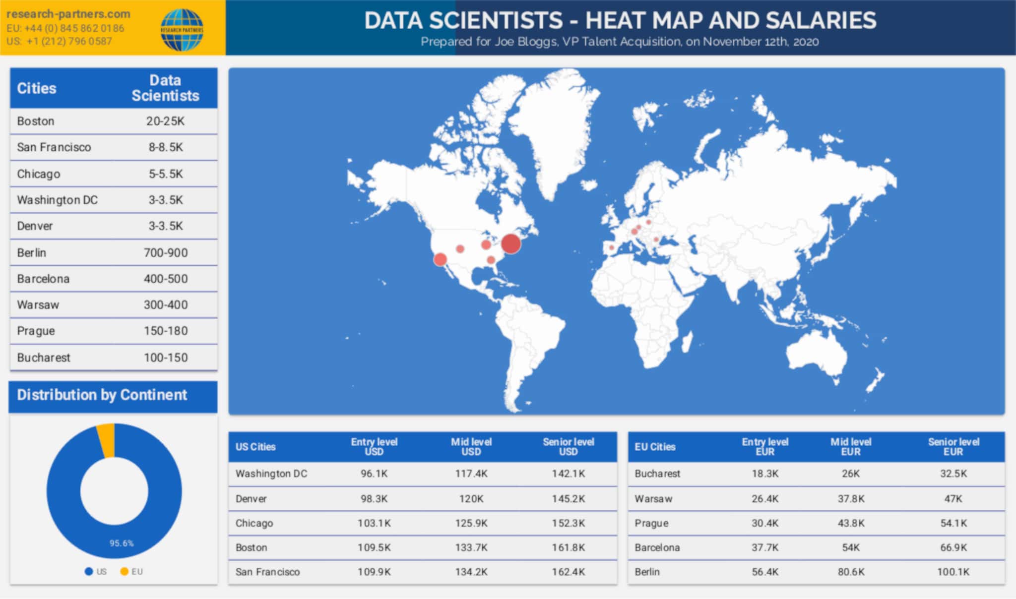
So at Research Partners we show this story by revealing graphically through charts and diagrams the experience and background of our candidates. Tools like Data Studio, PowerPoint, and Infographics highlight industry experience, gender, location, skills and other useful information about the talent pool we are discovering.
 The longlist then becomes much more alive when the picture is painted clearly and when key areas of intelligence are separated and reorganized from the original talent data. This includes comprehensively displaying the ongoing progress of the sourcing methodology, such as the ratio of responses, interviews and submitted candidates.
I have also had the pleasure of supporting various organograms that define bodies and hierarchies of company and employee structure, including personalized profiles, photos, and achievements of key players. These especially come useful to capture competitive insight while understanding the backstory of teams, seniority, and corporate decision making.
I love bringing design components to many data-driven research assignments, and believe that visually engaging data can help explain the story and show the very human side of talent pools.